
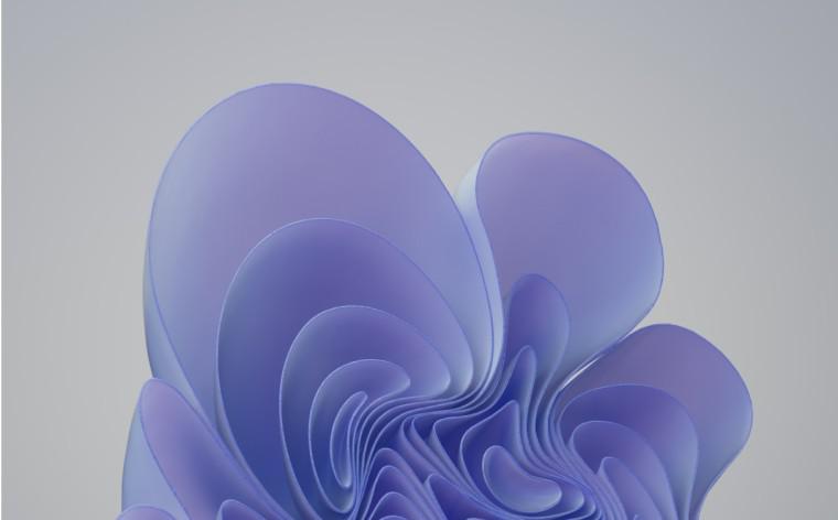
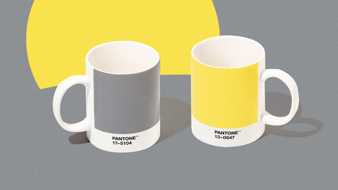
Pantone has just launched its colour of the year, following on from being optimistic and grounded in 2021, classic blue in 2020, and living coral in 2019. Their choice is ‘Very Peri’ which sounds like a spicy chicken and looks like violet (not so different from their choice of Ultra Violet in 2018?).
The colour is described as the “happiest and warmest of all the blue hues” and a “dynamic periwinkle blue hue with a vivifying violet-red undertone” according to a press release. Pantone claim that it combines the faithfulness of blue with the energy and excitement of red and signifies a transformation of our lives as we emerge from isolation (reflecting the optimism of this year more than the groundedness).
They emphasise that Very Peri is a completely new color (the first time that Pantone has created an entirely new color for this title) which “underscores the global innovation and transformation taking place in our society”. While I personally like this colour, it may that optimism is leading Pantone to focus on rhetoric rather than reality.


Words and colour #oftheyear – TapestryWorks
[…] Magenta follows previous colours of the year: ‘Very Peri’ in 2022, ‘Ultimate Gray’ and ‘Illuminating’ in 2021, ‘Classic Blue’ […]