
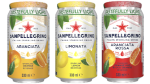
Earlier this year San Pellegrino launched a redesign of packaging for their range of sparkling juices. The old design was considered iconic by many, especially with its foil overlid (adding an extra element of hygiene) and traditional look and feel (see picture above).
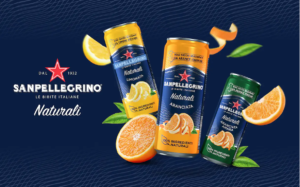
The new packaging design uses thinner cans and loses the distinctive foil top That might have been a move to minimalization and more sustainable materials, but that is not the reason given by the company (owned by Nestle Water), who said, “the new design features updated visuals reinforcing our distinctive values of natural ingredients and Italian origin … the new packs communicate taste and refinement”. They also described the new sleeker cans as “forward looking” (although coincidentally it allows them to place more cans in the same shelf space and taller thinner cans are now common in the category).
Are they making the same mistake as Tropicana did in 2009 (read more in a 2014 article written for SIM Magazine here)? Most people shop on autopilot with low-involvement processing, so making radical changes to packaging design risks shoppers walking past the brand in the aisle as they miss the cues and associations that they have learnt over time. Tropicana had to reverse their decision after losing 30 million in sales.
The move to a different dominant colour scheme also risks changing the meaning being communicated by the brand (not readily associated with natural ingredients, although arguably some association with Italy and the Azzurri, but not the flag and my recollection is of a slightly different shade of blue). The old-style cans included whole fruits and leaves that contributed to associations with freshness and healthiness. Finally, curvier and rounder shapes tend to be associated with sweetness and the new shape may move these associations to other taste profiles.
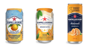
In summary, San Pellegrino have moved away from many of the distinctive brand assets that they had, especially the foil seals on top of the cans, and moved to something that feels a little more generic, less distinctive and less strongly associated with some of the values that San Pellegrino believe are at the core of their brand. You can see the evolution of the design above. Time will tell how well the change works.

Oxford University Press and changing your brand logo (Importance of Brand esSense #27) – TapestryWorks
[…] Is San Pellegrino repeating the Tropicana trap? (Importance of Brand esSense #26)September 21, 2022 […]