
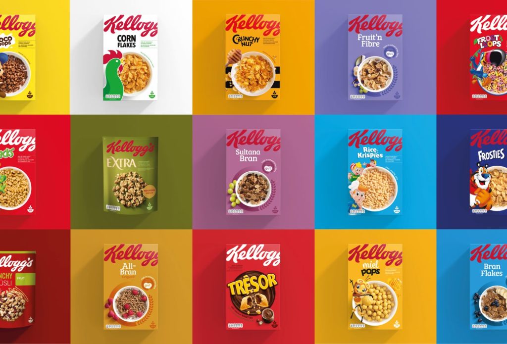
Kellogg’s have just announced a redesign of their range of breakfast cereals in the UK and across Europe, and on first look it looks like a really smart change, making good use of their existing brand assets, strengthening those assets and increasing visibility of the overall brand as well as individual varieties. Kellogg’s say that this is the first time it has, “attempted to change the look and feel of its whole cereal range in one go”.
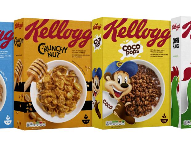
The new designs incorporate different colours and icons for all varieties, including many of the well-known characters such as Tony the Tiger and Snap, Crackle and Pop which have become a more important part of each packs identity, although less connected to product itself in the picture on the front of each pack (they used to hold bowls and utensils. This may be in light of recent campaigns against using cartoon characters to promote brands to children.
The Kellogg logo has been made larger and appears across the top of each box with some of the logo outside the box, while the name of the cereal is smaller (relying on colour and icons instead). Kellogg’s claim that the majority of consumers were able to find packs more easily on supermarket shelves with the new designs. The use of the logo relies on existing awareness (in reality the script is quite similar to Coca-Cola with red on white rather than white on red) and the behavioural principle of creating puzzles that the human brain recognizes while creating curiosity.
The artwork also reflects a more natural look and according to Kellogg’s, “the heritage of the brand story”. In addition, the new designs incorporate traffic lights nutrition labelling for the first time, which uses colour codes to flag the healthiness of food and drink, following substantial reformulation work to make many products healthier, including axing Ricicles with their sugar covering and reducing the sugar content of Coco Pops and Rice Krispies. Last year, Kellogg’s launched a premium product range under the brand name W.K. Kellogg, including vegan and organic cereals.
I’m not surprised that shelf visibility is good, because the redesign makes good use of the brand’s existing assets, and more importantly creates a more consistent look and feel across all the varieties, while retaining differentiation of each cereal. This new look will strengthen the visibility and presence of the brand, and strengthen its assets over time, even if the cartoon characters eventually have to go (a distinct possibility). A great example of understanding and leveraging your core brand esSense.