
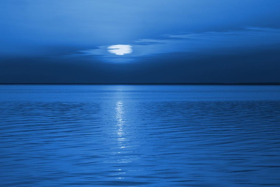
Pantone has announced their colour of the year for 2020. Unlike the more contemporary choices of the last two years, the most recent selection goes back to “Classic Blue” (Pantone 19-4052). Many people consider this a ‘safe’ choice, given the reaction to previous ones. Blue is regularly and consistently popular around the world (including work I’ve been involved in).
Blue is the colour of the sky and the sea (at least sometimes, although rarely seen elsewhere in nature), and as the semiotician Greg Rowland notes, “blue is something that is extremely common if we look up but extremely rare if we look elsewhere, one of the reasons why blue eyes are valorized in Western culture.” Pantone describe it as “elegant in its simplicity”, “reflective”, and “an anchoring foundation”.
Blue is seen in many cultures as optimistic and positive (ELO’s “Mr Blue Sky” is still a favourite song of mine) and in some ways the opposite of red, which can signify danger although has more positive associations in some Asian cultures. It is also often seen as a more introspective and thoughtful colour, and one that is more abstract than many, given its relative absence from nature apart from the sky.
Pantone spin this as a combination of vision with concreteness and tranquility, and is also often associated with quality, reliability and trust. Maybe a sign of the times? It chimes with other organizations that have chosen the related colours of Naval and Chinese Porcelain for 2020 (Sherwin Williams and PPG). Others have chosen different shades of green, reflecting another key trend of 2019.
Let’s hope that 2020 turns out to be a classic year more than a ‘blue’ one.

2021: Are you feeling optimistic or grounded (or both)? – TapestryWorks
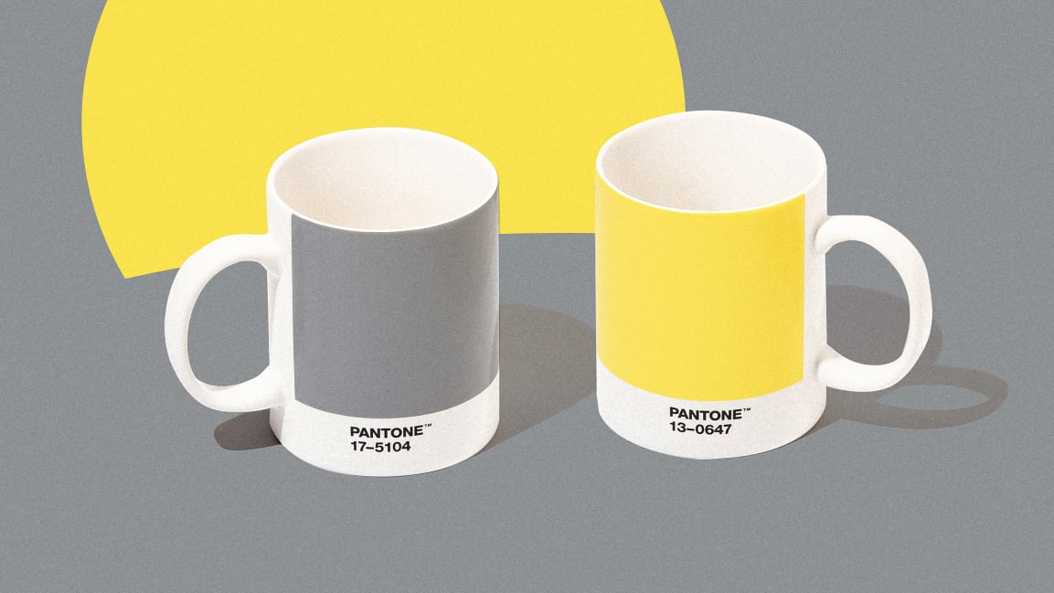
[…] Pantone 13-0647 (called ‘Illuminating’). This follows on from 2020’s Classic Blue (read more here) and 2019’s Living Coral (read more […]