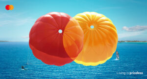
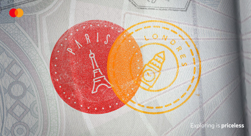
We have written about Mastercard’s development of brand assets (colour, taste and sound here, fragrance here, and the process of sensory signatures here). Their recent advertising campaign is a great example of making the best use of your visual assets in a creative way that links them to their long running ‘priceless’ campaign.

The executions that I have seen work across a number of different categories (holidays, sports, music, food) and linking the visual asset of the two coloured circles to the overall theme of experiencing the world (and in a very experiential way).

It’s a great use of a visual asset that promotes the brand in a memorable and interesting way. You can see more examples below.