Burberry have announced a new look for their brand, the first time it has been updated in 20 years. Frankly the new logo is underwhelming, generic and meaningless in the worst sense of the word (apart from the brand name itself).
Whatever you thought of the old logo, it did have personality and style, and its heritage and distinctiveness, as well as the symbol of the knight on a horse, made it immediately recognizable. Although the designer, Peter Saville, has publicly boasted that it only took four weeks to create (and I can’t imagine what he was paid), it looks like it took him a couple of minutes in Powerpoint or Word. And do we really need to know that London is in England?
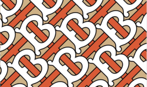
At the same time, they have also introduced a monogram with a new modern design that uses the letters T and B from the brand’s founder, Thomas Burberry. It is quite striking in white, orange and beige. If only they had applied the same creativity to the brand logo!